Our logotype
The logotype is the symbol of our brand. It is the primary carrier of our identity and the values we stand for. It must always be used when SLU is the sender.
Get the logotype in its basic form
The primary format to use is colour (red and green) against a white background. When this is not possible, a black or white logotype can be used. Choose the version, white or black, that offers the best contrast. If the background is chequered or multicoloured, a logotype on a white plate can be used.
The logotype may not be changed, distorted or combined with other symbols or badges.
Do you need to label up work clothing? See separate information on logo and labeling here.
SLU as the sender
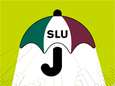
The parent brand SLU is the umbrella that covers all of the university. SLU should primarily stand as a single brand, making the logo the clear overall sender.
All parts of our organisation should have descriptive names. No individual organisation logos are permitted. The first time the university’s name is used in copy, it is always spelled out – the Swedish University of Agricultural Sciences, SLU. After that you can use the abbreviation SLU.
In some cases, the recipient may need to know what part of the organisation is the sender. In such cases, our logo is used with the organisational unit's name as described in the visual identity guide.
Logo in international contexts and in collaborations
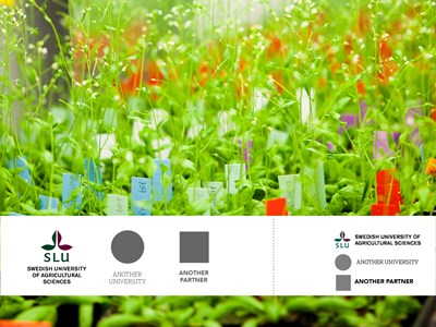
When SLU is the sender along with other organisations, agencies or businesses, use the basic design logo for Swedish contexts. In international contexts, we use the logo with the name in English.
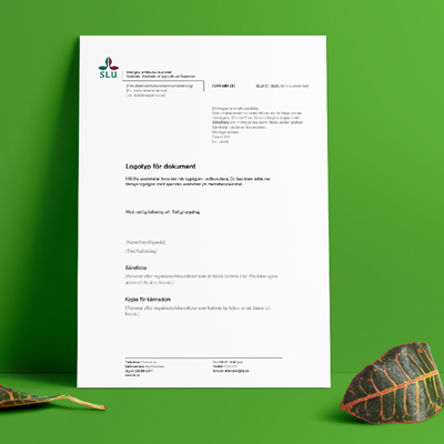
Logo for documents
This logo, with the university name printed in two languages, allows you to add a specific sender in the organisation under the line. It is used in more formal documents, such as internal governing documents, certificates and letters.
Our Word templates contain this logo in the page header with space to add the specific sender.

Our logo since 1996
SLU’s logo was designed by royal calligrapher Lars Laurentii and came into use on 1 January 1996. The red and green colours represent nature and life. The symbol is non-figurative and can be interpreted in many ways.
