Contact
Brand Management and Communication Platforms Unit
Division of Communication
- Questions about branding: varumarke@slu.se

Graphic elements are objects you can use in your design. Read more about how to use the brand promise as a word picture, or the wedge, in your communication.
The brand promise in the form of a word image is one of our graphic elements. It describes our identity.
In our communication, we use the word image as a payoff, clarifying the university we want to and can be.
The word image creates visual recognition, so it must not be changed or distorted. To enhance our international profile, it only exists in English.
The word image never replaces the logo and is thus never the sole sender. In a multiple-page production, the word image and logo may be placed on different pages.
The word image may be used in one of our colours, made opaque and have the image collage inside it. It is primarily presented in a landscape format, but can be used in portrait format.
The landscape word image always has free space around it, with the logo centred above it. The proportions between the logo and word image may not be changed.
In portrait format, the word image should bleed to the edge and be turned 90 degrees anticlockwise. In portrait format, the logo is not to be turned, and it can be placed in another nearby location.
You can download various versions of the word image, both with and without the logo. The word image with the colour logo on a white block is the preferred version when it is possible to have the white block bleed to the top edge. When this is not possible, for example on logo shirts, use the version without the white block.
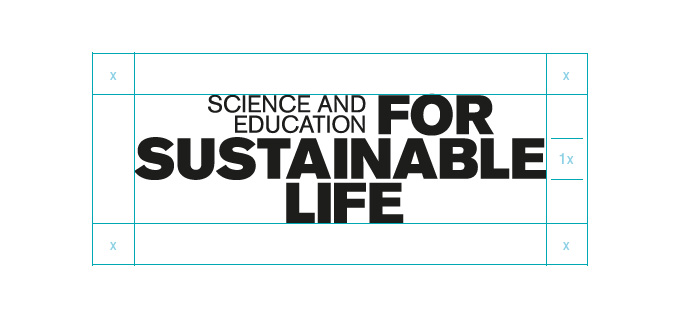
The free space around the word image is the height of a letter of the larger text (an x) on all sides.

The word picture in landscape and portrait format, with the profile collage, black and colour from SLU´s colour palette.
1/4

The word picture with and without logo on a white block.
2/4

Picture from SLU:s poster templates – the wedge in landscape and portrait format.
3/4

Example of using the wege as a divider, at the front of a university map and used in landscape format.
4/4
The wedge is the other of our two graphic elements, a decorative ingredient that creates a sense of forward motion.
The wedge is used as a divider between images, or between an image and a colour field. It should not be used with the same colour or motif on both pages. The wedge should always bleed.
The angle of the wedge should be proportionate to the rest of the content, but should not be so wide that it dominates the visual impression. The wedge must always be in one of the colours in our palette and can be made more opaque.
The wedge is mainly used in portrait format, angling up and to the right. It can also have the point up towards the left if this suits the content better, or be used in landscape format in a page header or footer.
Brand Management and Communication Platforms Unit
Division of Communication
The word image with the colour logo on a white block is the preferred version when it is possible to have the white block bleed to the top edge.
The word image version without the white block.
You will find them on the Illustrations page.