Contact
Brand Management and Communication Platforms Unit
Division of Communication
- Questions about branding: varumarke@slu.se

The logo is the symbol of the SLU brand. Is the main bearer of our visual identity and must always be used when SLU is the sender. The logo may not be changed, distorted or be included in other symbols, logos, brands or similar.
SLU’s colour logo on a white background is the preferred choice wherever possible. In cases where this is not possible, a black or white logo can be used. Choose the version – black or white – that provides the greatest contrast and visibility against the background. If the background is multicoloured, the logo can be printed on a white block.
SLU’s logo should be placed in a clearly visible location on all of our products. In printed matter, such as magazines, it should be on the cover. 
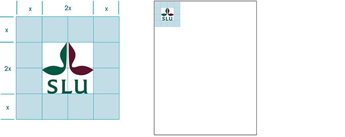
The logo should have free space around it. Do not place other objects, such as images or text, within the free space. The space around the logo is half the logo's height or width (x) in all directions.
As a rule, the SLU logo is placed in the upper left-hand corner. The smallest distance from the edge of the page is the logo’s designated free space. It can be aligned with the page margin.
Exceptions from the upper left corner placement include promotional products, signs, film graphics and the logo combined with the brand promise. The smallest permitted printed size of the logo is 9x9 millimetres.
If the background is multicoloured, the logo can be printed on a white block. This improves visibility. In some cases the block can also be used on a white background, if this improves the layout.

Place the block in the upper left corner. The block should bleed to the upper edge and align with the left margin of the body text.
Workwear from SLU must always bear the university logo and be labeled in accordance with the graphic profile. See more information about this here.
Brand Management and Communication Platforms Unit
Division of Communication