Contact
Brand Management and Communication Platforms Unit
Division of Communication
- Questions about branding: varumarke@slu.se
In SLU´s visual communication, the green impression dominates. The red colours are used as accents. The colours are also found in our images.
Alongside the red and green, we also have complementary colours like blue, yellow-brown and a scale from black to white. The many colours in the palette allow us to bring our activities to life with breadth and variation.
The colouring can be toned up to catch the eye, or toned down to convey a sober calm.


The colouring can be toned up or down.
To brighten up the mood of the dark colours, we can work with small accents that catch the eye, alter the opacity of the wedge or the zoom on the image collage instead of using blocks of background colour. This adds touches of vibrancy and cheer.

Vibrant accent in Raspberry Red.
Be sparing with coloured lettering, and make sure it contrasts well with the background.
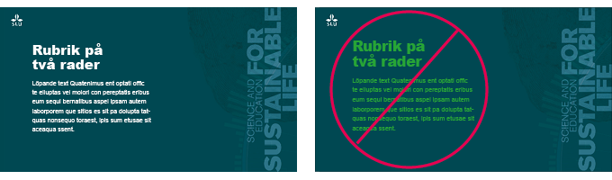
Think about readability if you use coloured lettering.

Label with the colour Apple, toned white. The image contains tones of LIght brilliant amber, Strong raspberry, Light brilliant red and Dark rose.
1/2

Examples of colour use that gives a a clear, overall green feel together with the complementary colours in the image.
2/2
Brand Management and Communication Platforms Unit
Division of Communication