Facts:
You can use the SLU colours in colour squares in for example Indesign documents using Adobe Swatch Exchange files (.ase). Download the files and import them to your colour library.
• SLU colour palette – Pantone Solid Coated (.ase)
SLU’s colour palette bolsters the identity colours and creates a wealth of opportunities. It consists of 26 colours in dark, bright and light shades.
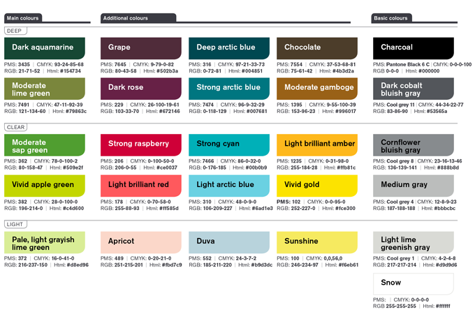
There is a pdf version of the colour palette for printing. The colours are also listed further down on this page together with the corresponding codes.
We make a green impression to create a clear, overall green feel. The red colours are used as accents. Our graphics also reflect the red and green colours. A well-considered choice of images lets us create an overall green feel to our communications.
Alongside the red and green, we also have complementary colours like blue, yellow-brown and a scale from black to white. The many colours in the palette allow us to bring our activities to life with breadth and variation.
Our colour palette has dark, bright and light tones. The brighter colours are used as a signal or contrast to the darker colours. These include the basic colours white, black and grey, all of which contrast well with the other colours.
We can tone up the colouring with a selection of brighter colours to create attention-grabbing effects. We can also use darker colours to tone it down and create a more solemn or peaceful feel.
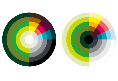
The colour wheel illustrates the proportions between the colours in our palette and how they are to be used. The colours can be combined to create various forms of expression: A darker, more sombre theme, consisting of mainly dark colours, or a brighter theme dominated by lighter colours.
SLU’s colour palette consists of 26 colours in dark, bright and light shades. The colours can be combined in various ways depending on the tonality you want to express.
All colours work both in print and digital channels. Accessibility meets the requirements for public authorities. The colours can be used for colour plates, video graphics, banners and illustrations. The colour palette is available to all SLU operations.
PMS: 489 | CMYK: 0,20,21,0
RGB: 251,215,201 | Html: #fbd7c9
PMS: 178 | CMYK: 0,70,58,0
RGB: 255,88,93 | Html: #ff585d
PMS: 206 | CMYK: 0,100,50,0
RGB: 206,0,55 | Html: #ce0037
PMS: 229 | CMYK: 26,100,19,61
RGB: 103,33,70 | Html: #672146
PMS: 7645 | CMYK: 9,79,0,82
RGB: 80,43,58 | Html: #502b3a
PMS: 372 | CMYK: 16,0,41,0
RGB: 216,237,150 | Html: #d8ed96
PMS: 382 | CMYK: 28,0,100,0
RGB: 196,214,0 | Html: #c4d600
PMS: 362 | CMYK: 78,0,100,2
RGB: 80,158,47 | Html: #509e2f
PMS: 7491 | CMYK: 47,11,92,39
RGB: 121,134,60 | Html: #79863c
PMS: 3435 | CMYK: 93,24,85,68
RGB: 21,71,52 | Html: #154734
PMS: 552 | CMYK: 24,3,7,2
RGB: 185,211,220 | Html: #b9d3dc
PMS: 310 | CMYK: 48,0,9,0
RGB: 106,209,227 | Html: #6ad1e3
PMS: 7466 | CMYK: 86,0,32,0
RGB: 0,176,185 | Html: #00b0b9
PMS: 7474 | CMYK: 96,9,32,29
RGB: 0,118,129 | Html: #007681
PMS: 316 | CMYK: 97,21,33,73
RGB: 0,72,81 | Html: #004851
PMS: 100 | CMYK: 0,0,56,0
RGB: 246,234,97 | Html: #f6eb61
PMS: 102 | CMYK: 0,0,95,0
RGB: 252,227,0 | Html: #fce300
PMS: 1235 | CMYK: 0,31,98,0
RGB: 255,184,28 | Html: #ffb81c
PMS: 1395 | CMYK: 9,55,100,39
RGB: 153,96,23 | Html: #996017
PMS: 7554 | CMYK: 37,53,68,81
RGB: 75,61,42 | Html: #4b3d2a
PMS: Cool grey 1 | CMYK: 4,2,4,8
RGB: 217,217,214 | Html: #d9d9d6
PMS: Cool grey 4| CMYK: 12,8,9,23
RGB: 187,188,188 | Html: #bbbcbc
PMS: Cool grey 8 | CMYK: 23,16,13,46
RGB: 136,139,141 | Html: #888b8d
PMS: Cool grey 11 | CMYK: 44,34,22,77
RGB: 83,86,90 | Html: #53565a
Adapt the colouring to the context. The colouring can be toned up to catch the eye, or toned down to convey a sober calm.
The colours in SLU’s palette have been tested to achieve at least AA in the Web Content Accessibility Guidelines (WCAG). Remember that there are many parameters affecting the WCAG, such as the font size and weight, writing in images and so on.
Be sparing with coloured lettering, and make sure it contrasts well with the background.
Colours look different depending on whether they are printed using PMS (the Pantone Matching System) or CMYK; on coated or uncoated paper; if shown on a screen or in embroidery. Use the Pantone Matching System when assessing a colour.
You can use the SLU colours in colour squares in for example Indesign documents using Adobe Swatch Exchange files (.ase). Download the files and import them to your colour library.
• SLU colour palette – Pantone Solid Coated (.ase)
Brand Management and Communication Platforms Unit
Division of Communication