Facts:
SLU´s graphic profile and components, such as our illustrations, may only be used when SLU is the sender together with SLU´s logo.
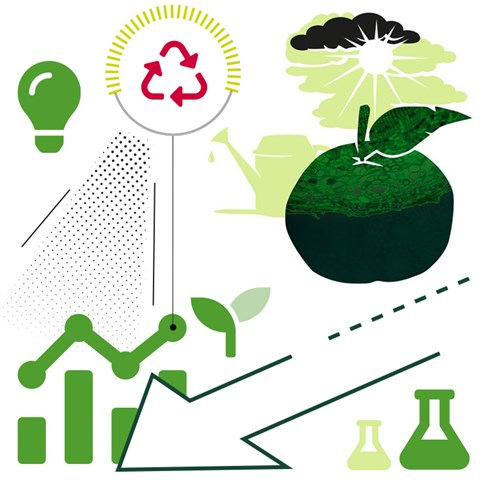
Illustrations help us to describe something that cannot be conveyed in a photograph. If you want to create effective infographics, you can combine some of these objects, colour in a couple of SLU´s profile colours and add short texts or messages.
Please note that the components within SLU's graphic profile, such as our illustrations, may only be used in accordance with the graphic profile, and when SLU is the main sender of the material.
Illustrations help us to describe something that cannot be conveyed in a photograph. Our illustrations are based on authentic pictures and have relevant motifs linked to our activities. For example if we make an illustration of a Swedish sea, we illustrate it with domestic fishes and plants.
In terms of technique, our illustrations are true to life and relatively detailed with fine, clear, carefully drawn contours. The illustrations are easy to use in layers, with different colours and opacity, and with image applications.
The illustrations can be used for printed material and digital purposes, and they come in three different styles:
The name of the illustrator should be stated next to the picture.
Fredrik Saarkoppel created most of the illustrations originally, and Infab AB has subsequently simplified them to make them easier to use and filled them with cutouts from the profile collage. Some of the newer illustrations are created by Michael Kvick and Jenny Svennås-Gillner.
Icons and pictograms provide a simple illustration of a context, clarify a feature or support a message. Icons are the simplest form, with few details. Pictograms are designed like icons, but contain a bit more detail and are more informative.

Font Awesome has ready-made icons that we use in certain contexts, such as online. If you draw your own icons, start from the explanatory examples to the right.

You can design your own pictograms like the example here. To ensure recognition, you may need to use specific pictograms, for example on fire extinguisher signs.

Lines, arrows and dots are used to clarify and emphasise in a playful way.

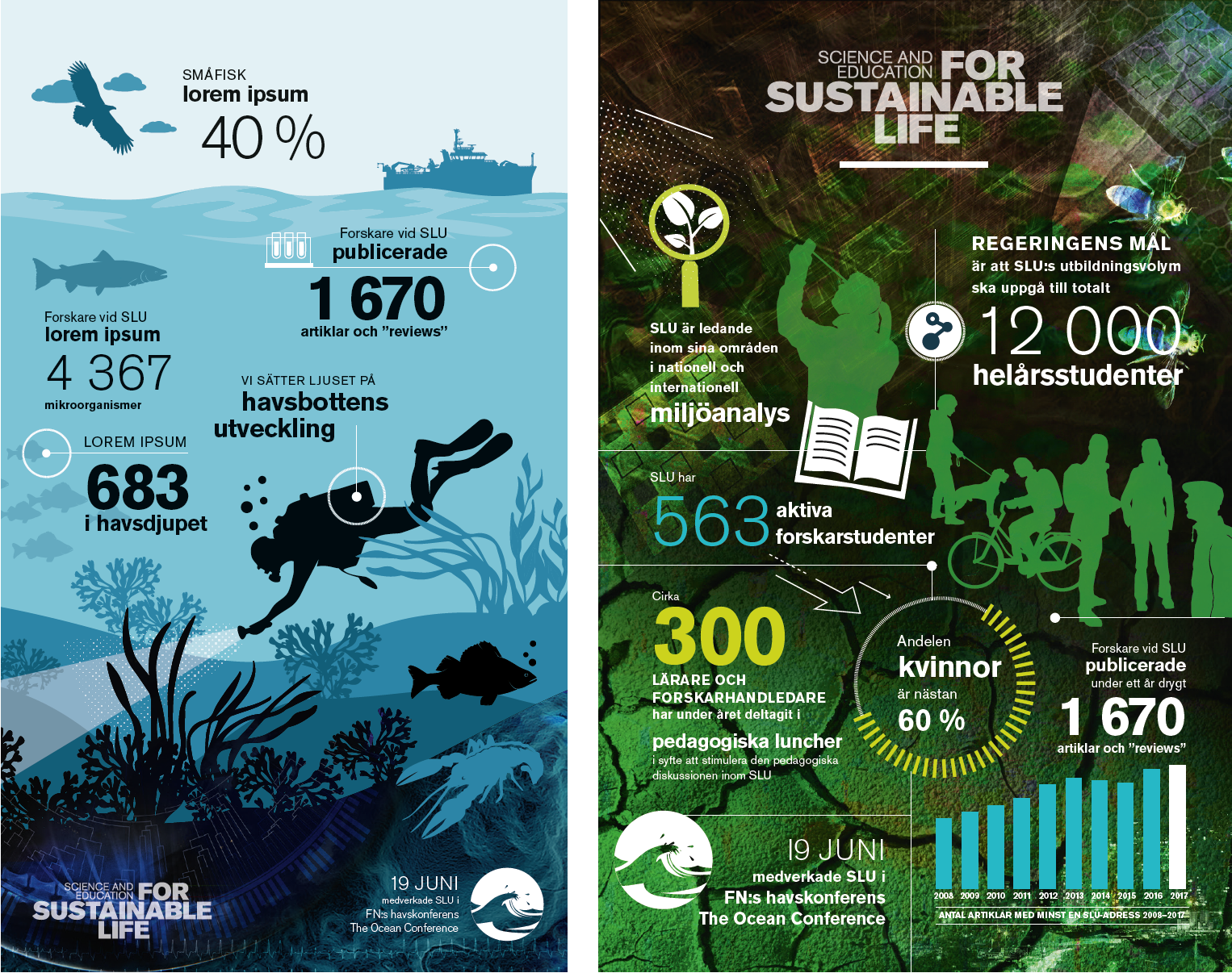
Infographics combine words and images in order to visualise difficult concepts in a simple, engaging way.
When you make infographics, you can use SLU’s illustrations, copy, graphic elements and colours. You might even use parts of the image collage.
The infographic might be an illustration emphasising certain details and linking them to figures and messages.
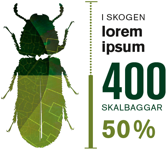
Infographics can also consist of a background from an image collage or a colour block to which illustrations, figures and messages are added.
Add lines, arrows and dots to create flow, direction and clarity.
SLU´s graphic profile and components, such as our illustrations, may only be used when SLU is the sender together with SLU´s logo.
Brand Management and Communication Platforms Unit
Division of Communication
SLU´s colour swatches are available as .ase files. Load them into your Adobe programs to have them ready whenever you need them. Download the files and import them to your colour library.
• SLU colour palette – Pantone Solid Coated (.ase)