Contact
Brand Management and Communication Platforms Unit
Division of Communication
- Questions about branding: varumarke@slu.se
This is what SLU's communications material can look like.
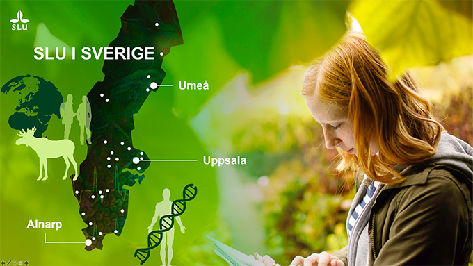
From SLU’s Powerpoint presentation. You will find the whole presentation at the SLU webpage for information material.
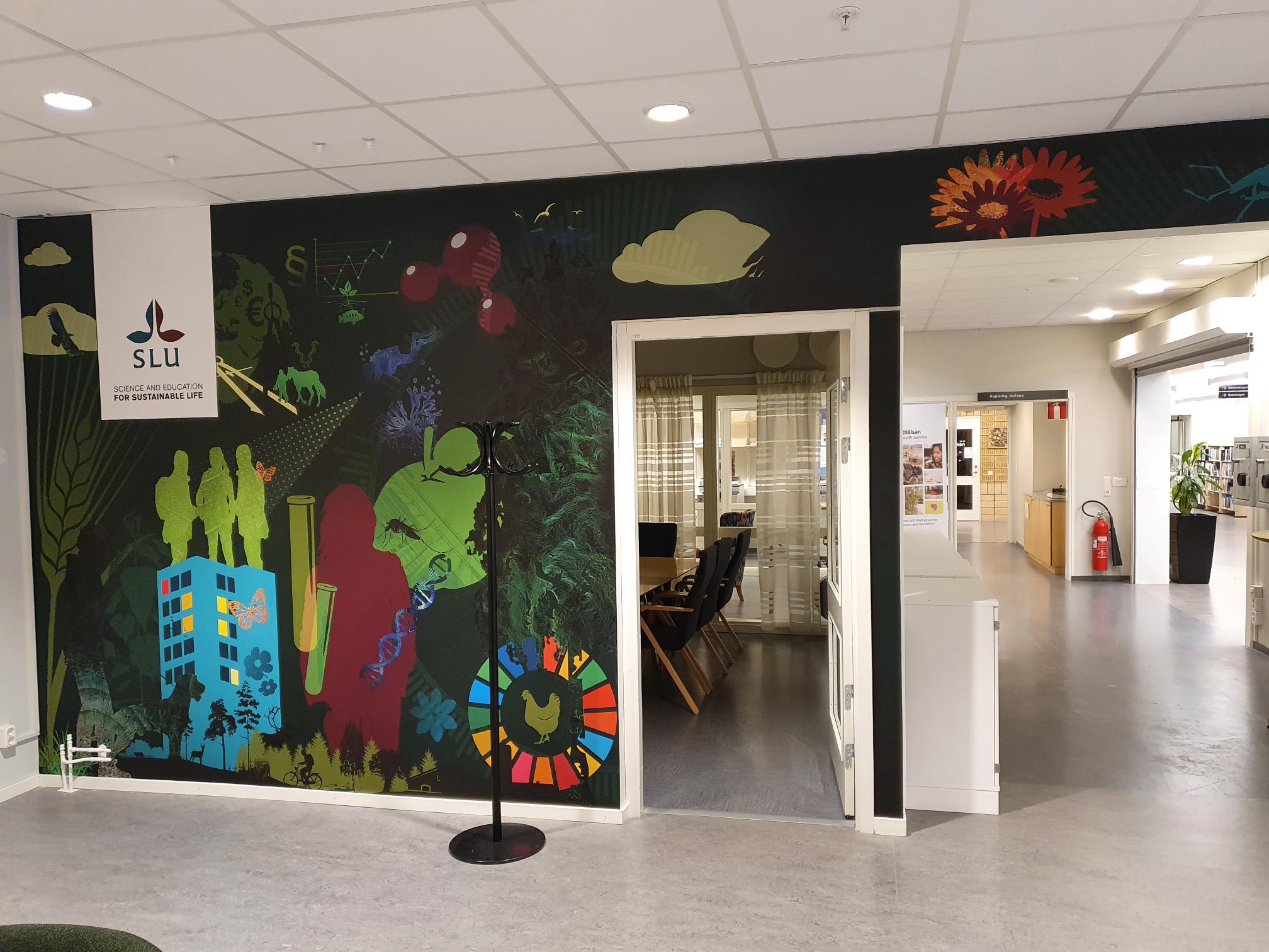
Collage with SLU:s colors and illustrations in Umeå. Read more about SLU´s profiling walls here.
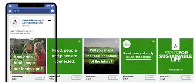
Carousel advert for the Master’s programme Food and Landscape. This ad ran during the international admissions period.
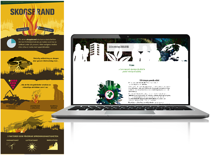
Example of an infographic and SLU’s strategy online.

Examples from the video SLU is you, where our illustrations were used in animations.
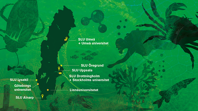
From the Powerpoint presentation.
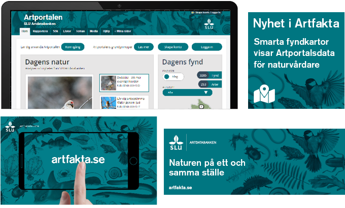
The SLU Swedish Species Information Centre profiles itself based on SLU’s visual identity along with a pattern of their own illustrations. This creates clear recognition and fits in with SLU’s other communications.
Top: The pattern used in the Species Observation System page header and image button in Episerver. Bottom: Image from a video from the Species Identification website and example of a banner from the launch of the Species Identification website.
Brand Management and Communication Platforms Unit
Division of Communication